


Now it's Official - More Vaccinated Have Died from COVID than Unvaccinated...
& More Jabs = More Death

Health Canada has feverishly tried to hide the true numbers and when providing weekly reports and they got a lot more guarded on the information that they’d post…reason being, if they showed the general public that people are still dropping like flies following vaccinations - from COVID - then their whole narrative of Safe and Effective goes right out the window…
I talked about this a couple weeks back - August 29th, but the up-to-date reporting on this date was only to June 26th, 2022…

Now that it’s been updated to August 14, 2022 - 2 weeks prior to my forecast on the Unofficial Stats…guess what?

We are now seeing that more than 50% of the Cases, Hospitalizations and Deaths are in the vaccinated community…but it’s actually a lot worse than it seems.
When you would originally pull this chart up, there was an inclusion for “Cases not Protected” and for “Partially Vaccinated…and if you look at the above graphs, these groups are no longer represented.
Cases Not Protected - meaning they got the jab and caught COVID within 14 days.
Partially Vaccinated - meaning they got the jab, survived 14 days but not long enough to get their second jab.
Because Health Canada hasn’t been exactly forthcoming with accurate information, including blending in hospitalizations and mortality from the one province that isn’t actually reporting status - still unnamed - and because they continuously have misreported numbers, it’s really hard to know what this represents…but we can kinda figure this out.
From the previous report, with the cases not protected and partially vaccinated removed from the last report, the numbers added up to 91.1% of the total deaths…this number has grown to 91.5%, meaning that there has been an increase in deaths in those whose minimum level of jabbedness is 2 shots - or “Fully Vaccinated”. However…if we look at these 2 dates, side by each…

We can see that there was a DECLINE in both the Unvaccinated and originally “Fully Vaccinated” (now showing as Primary Series Completed), by a Net 3.5% difference and an INCREASE in the Boosted and Double/Triple Boosted by Net 3.9%, these numbers are actually pretty dramatic…because adding additional boosters is not only NOT WORKING to save lives, it’s actually shown mortality to INCREASE following each dose after having been “Fully Vaccinated”!
This really wasn’t a shocker because I’ve shown numerous times how with more doses, there is more death and it’s been more than apparent for a long time now…back on June 8th, 2022 we could see that the Boosted Deaths had officially outpaced the Fully Vaccinated Deaths:
And these numbers were from May 22, 2022…Officially reported by Health Canada!
Now…I want you to sit back and think about what this actually means on the Grander Scale of things…
Following each subsequent jab, there are additional deaths - meaning NO PROTECTION;
People who survived COVID prior to a 3rd, 4th and 5th Jab are dying from COVID following a 3rd, 4th and 5th Jab;
Each subsequent strain of COVID has lessened in severity; while
Those with more jabs are outpacing not only the unvaccinated, but the ones who were smart enough to quit after 2; and then there is
Your tax dollars are being used by the Government of Canada to Promote Vaccinations in Children, while you will be permanently suspended from Social Media Platforms for recognizing that Children were never at risk and that the more jabs you get, the more risk you are at from COVID:


Promoted Tweet means that the Government of Canada is paying for advertising for Big Pharma, because Big Pharma isn’t allowed to do their own promoting…the message?
COVID-19 vaccination will increase your child’s protection against severe illness…when no matter what age cohort we review, this is exactly 100% False - in that there has been more Hospitalizations, ICU admissions and Mortality with/from COVID since the jabs were first rolled out and with each subsequent jab.
How many more?
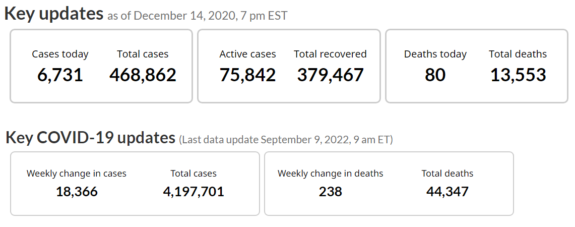
Vaccines officially rolled out on December 14, 2020 and there were 13,553 deaths. Since then, there have been an additional 30,794 COVID related deaths or an increase of 227%.
What you need to also keep in mind about this, is the wording that Health Canada uses/used and how the deaths were actually reported.
In some provinces, those who were vaccinated and died before 14 days, these people were reported as “Unvaccinated Deaths”. Did Health Canada include these in their skewed reporting? Did they actually receive a breakdown on these numbers from Each Province?
If they were, they’d fall into a group called “Cases Not Protected”.
PROTECTED - being the most operative word here because how can the MAJORITY of Deaths now be in the Group that has been Fully Protected and Reinforced with more jabs than the original protection, if protection was actually a thing?
It seems most accurate to identify that all of those who were in fact “Protected” and still DIED, really didn’t have that much protection…or they wouldn’t be DEAD!
What we are now being asked to believe is that with another unproven jab that we will now see some protection:
And if you don’t believe that, with up-to 80-90% having taken the New Jabs within 6 Months of their Previous Jabs, we may see more of the same nightmarish mandates and lockdowns…with the messaging, we have to “One of the Best Things we Can Do Prevent the Pressure on our Health Care System…is GET MORE JABS”!
Listen, the only way that this prevents pressure on our Health Care system is because people are going to DIE before they ever hit the ICU’s - as we’ve seen throughout this entire pandemic. The people who are at HIGHEST RISK by way of Age, never actually make it into the ICU…current standings showing…out of the 36,421 deaths in those aged 70+, only 9,939 ever made it to ICU.

That is…of those who made up 82% of the total COVID Mortality only 27% of them burdened the ICU’s…because they died before admission.
So…it’s official.
Has been for a long time…now supported by the worst statistics keeping that Health Canada has ever provided…The vaccines aren’t effective…my next stack will again be on were they safe?
[spoiler alert]: NO!

Great analysis of data and simplification for all the laymen around. CDC of BC removed donut charts after they realized that 90% if ICU and Deaths were among jabbed. That, itself, was more than enough proof of effectiveness!
This fantastic interactive analysis of New South Wales Health Surveillance Data showing the very same outcomes...pandemic in the vaccinated.
https://app.powerbi.com/view?r=eyJrIjoiODQ4NTg4OGUtNWU5ZS00MjQ3LWJmODgtNzI1N2RmOWY3N2Y3IiwidCI6IjZmMGU5YzQyLTk2Y2UtNDU1MS05NzAxLWJhMzFkMGQ2ZDE5ZSJ9&pageName=ReportSection1c3fdc161d4008c845a6