Alberta is Hiding Embarrassing Vaccine and COVID DATA.
You know things aren't looking good when...
Some of us just don’t deal well with change and admittedly, I am one of those people. When Dr. Deena announced that they were moving to weekly updates instead of daily, I was actually okay with this change. Never paid much mind to her interpretation of the data anyways, so no big loss. What I hadn’t expected is for the Provincial Website also moved to a weekly update.
What I also didn’t expect is that they’d remove the most embarrassing and telling data.
A large part of what is missing is what most people miss from the site because it doesn’t even really look like data but is some of the Most Important Data that has been available for tracking Vaccination Outcomes →Link
See. It’s not there!
I know you have absolutely no idea what I’m talking about and you not seeing something is probably the least exiting thing that’s happened to you all week…but here’s what is supposed to be there from the last available reporting period from March 17th, 2022:
See. Doesn’t look like the rest of the fancy data from Alberta with bar graphs and line graphs and tables and colorful lines and blinky lights…nothing. No fanfare, just 3 lines of information that really don’t seem to be all that interesting either…
It’s what you can extrapolate from these 3 lines that IS important. It’s like this…If you had a screen shot from the first reporting period back for 2022, you could compare the data to the above and actually figure out how many cases, hospitalizations and deaths there were in the vaccinated, subract that from the current totals and see how many unvaccinated make up these cases.
January 4, 2022 screenshot:
So, when you take these totals, subtract them from the Most Recent report and calculate the percentage of cases that are actually unvaccinated or are fully vaccinated. The info from these 2 points look like this:
Indicating that as of the most recent report (where this information was available), the Fully Vaccinated made up 84% of all new COVID Cases, 69% of the Hospitalizations and 71% of the deaths.
Now I understand that this data looks pretty bad if you were trying to build a case on Vaccine Effective Rate or even calculating to show that if the vaccines are even working on Omicron…but guess what? This data has been removed from the site as well:
It’s on the report from March 17, 2022…but you can’t find this chart on the current Vaccine Outcomes tab…why? Because the Vaccines are Worthless against Omicron and we all know it because of this:
Yeah. That big spike from December to March was all Omicron, where the province was increasing vaccinations on a daily bases.
So, why would the remove the Effective rate on variants instead of updating it?
What else is missing?
This:
And…Most importantly, it’s now missing this entire tab:
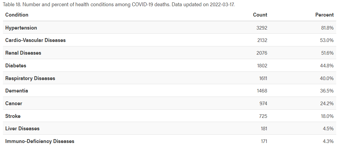
You see…this tab here is where I found out that there were increasing cases of kidney damage throughout the period where we were vaccinating.
As well as this colorful bar chart that indicates only 4.1% mortality in people with No Conditions:
Which also actually shows the breakdown in the following missing chart:
And lastly, the easy to view New Cases, Active Cases and Hospitalized showing the breakdown by way of vaccine status:
The above data is embarrassing for the Province where the unvacciated only made up 21% of New Cases, 17% of Active Cases and 31% of Hospitalized.
All of the data that is no longer available hides the fact that:
You were never in any jeopardy if you had no pre-existing health conditions.
Death at a glance showed highest death rate in the 70+ Age Groups.
The highest new case, current case, hospitalizations and deaths happened in the Fully Vaccinated population.
The vaccines have no effective rate that will be published online for Omircon.
And that they got tired of people looking at the last immediate posted chart to realize that if you have Zero Shots or Three, you are just as likely to catch COVID.
Great Job, Alberta.
Nice way to remove Full Transparency from the COVID Dashboard. You Bastards!


Thank you Sheldon for breaking this down for us layman to understand. It is people like you and other sites that are exposing this for the fraud it is and bringing this house of cards down.
Also, thank you for not taking your foot off the pedal on this issue which is what our governments are counting on.
I would have been happy if they took that site down completely - to stop people obsessing over covid. But the way they did it clearly shows they intend on hiding important data.
I also wondered about the changes to the geospatial tab. I assume, as most areas went from red to light yellow, it didn’t look as scary any more.