

You're going to want to see this - Ontario
You're going to want to see this - Ontario
Vaccinated Vs Unvaccinated Data

Now, I know a lot of you aren’t on Twitter…and that’s okay.
And even if you are on Twitter…may not follow me…and that’s okay too.
But for the time that I’ve had available, it’s been a good place to vent in fragmented sections instead of busting out a whole substack.
Over the last few months, it’s been great being able to bust out the Canadian Data without my posts being censored or without me being banned but it has been a little wild-west…and, welp…you know me with my potty mouth. Even this hasn’t gotten me punted.
Anyways…in a thread I was invited into, with a supposed immunologist and a few other circle-jerkers, I was put to the challenge…and in this, I was presented with a Data Link from Ontario. To be honest, I never really looked at the Ontario specific data with exception of the totals posted by PHAC in their epidemiology update…so, I’d actually learned a little something by downloading the data and sorting it out…and you’re gunna wanna see what I found.
Now, I was presented and challenged to dispute what this information was showing…this image specifically, using data found →Link:

And of course, you can already see the issues with this…
It’s only current from Mar 1 to Apr 30, 2021.
It only includes those aged 60.
It’s per 100k Data.
The per 100k Data thing pisses me off because it still hides the fact that there have been more COVID deaths in the Vaccinated camp than the Unvaccinated…as in, we’ve already crossed the threshold of more vaccinated have died in 2 years of vaccines than have in the full 3+ years of COVID.
But you see…the people that post shit like this, really have no idea what the fuck they are doing…most don’t understand spreadsheets…and even if they did, wouldn’t understand how to chart them out…
And I get it.
Charts n shit are boring…
Anyways…
After sorting the garbled mess and instead of picking a single age group, as was posted above…and instead of cherry picking dates…I mapped out the whole thing using the column that nobody else seemed to have wanted to use…it was called “ALL”.
Meaning, it was inclusive of ALL mortality in ALL age groups - handy be that!
And much to the chagrin of the nutsucks that were all chiming in…this is what it showed.
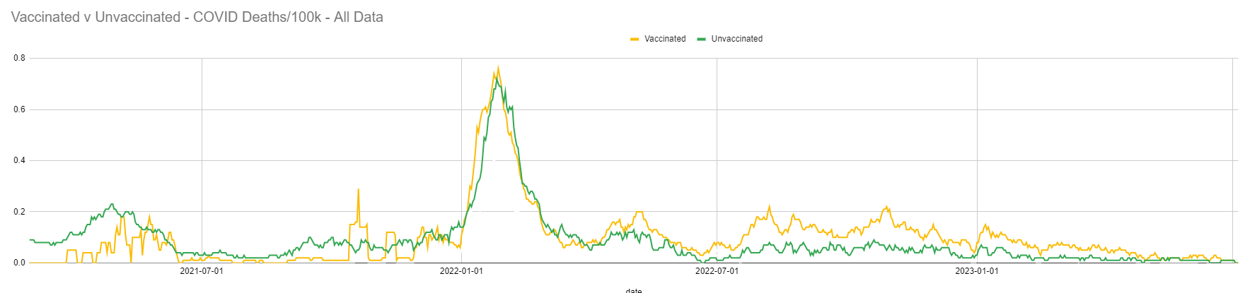
I get it…you may have to zoom in for full effect, but what it literally shows is that there was almost NO difference realized in vaccinations prior to the Omicron Wave…but since it hit, things have been progressively worse for the Jabbed.
Meaning…there was never any benefit…they knew vaccinated people were still catching, and dying from COVID throughout…and have known since January 1st, 2022 that the Vaccinated have been doing worse!
If you do download the data and play around with it…you’ll most likely not see the exact image because the grouping is a little different. It breaks them up into 3 groups, where there is a boosted, fully vaccinated and what they consider unvaccinated…but even in this, unvaccinated data is contaminated. According to the description provided:

There really is no “Unvaccinated” people parsed out…it includes people who’ve gotten the one jab of double-dose…however does say that this is a small and consistently changing number - or, maybe of no real significance…or maybe they are hiding deaths in here too…I don’t know.
The data, is also incomplete because some people didn’t consent to be in the COVaxON tracking.
Weird to think that people would consent to being a labrat, but not consent to having this information shared so that they could have had a Vaccine Passport and travel on plains and trains in Ontario…but, whatever.
So…when you use all 3 categories, you get a chart that looks like this:

And what you can see on this one specifically - the line in blue, is that people who’d received their booster or boosters, have been doing a lot worse since about March of 2022.
In honesty, I don’t know if the Boosted are considered the 4, 5, 6 and 7th jabs…but the image is quite clear. Boosting people was not a benefit…it saved NO LIVES and in actuality, seemed to kill more people - from the thing they were vaccinated x2 and boosted for - COVID.
And this is quite shocking itself…but where this gets even worse is when you take it out of the per/100k and try to figure out what these numbers actually look like.
With this, I can only guess, making some assumptions.
First assumption that I’m going to make is that the vaccines showed no discernable difference - yes, it looks worse for the unvaccinated…but I’m keeping them par for the sake that the data is corrupted and incomplete anyways.
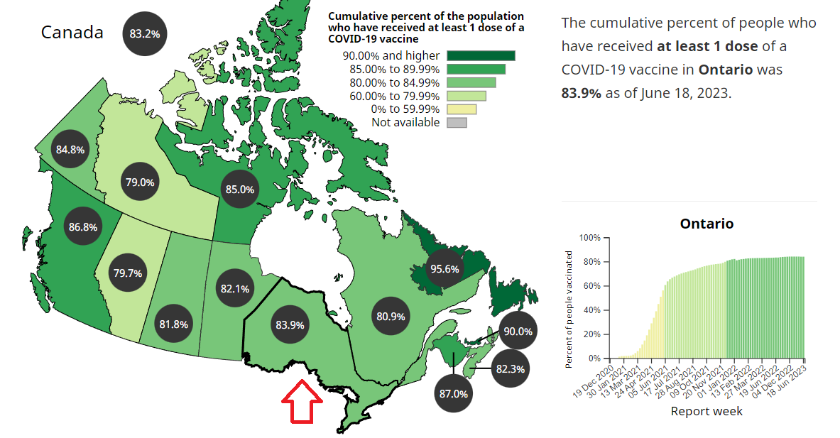
From here, I am using their vaccinated rate as 83.9%, as shown on the Health Canada Website:
From there, I am using the deaths - only starting up when this chart started - March 6, 2021…even though Health Canada uses December 14th, 2020 as the official Jab Start Date and data that I have only goes up to June 10th, 2023 - which shows that there are a sum total of 9,581 COVID Deaths.
So…we take the deaths x the vax rate - keeping all else equal and we get 8,038 Vaccinated Deaths…vs 1,543 Unvaccinated Deaths.
To get a full idea of what this looks like…it’s like this:
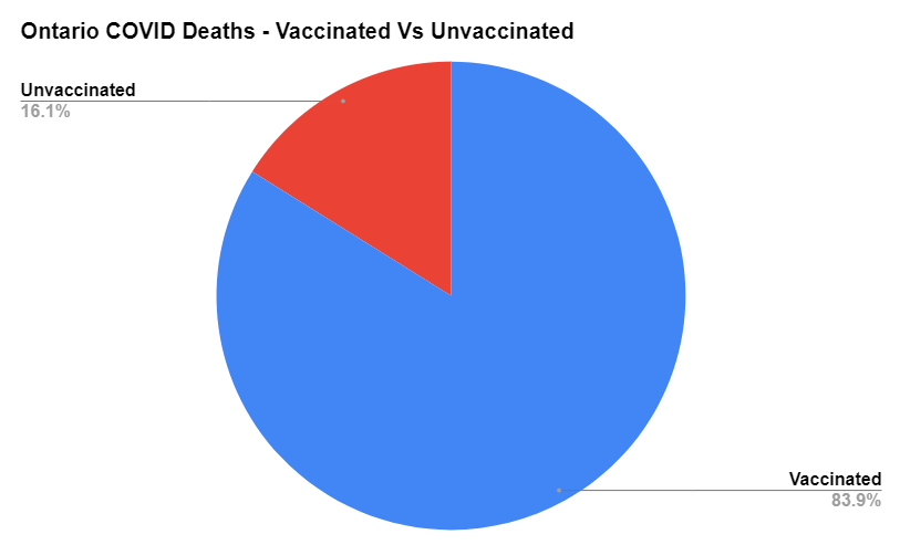
And this is fucking terrifying.
All of these deaths that weren’t protected by the vaccines…all of the people who were forced into jabs…all of the injuries that came from the vaccinations…and this is the result.
This doesn’t touch what the costs of the jabs were nor the measures used to close down businesses and fire people over Not Taking the Jabs…nor the turmoil it caused to those families that were fired from their jobs - not forgetting the Healthcare Workers that are still not fully welcomed back to work…
Seniors in LTC not able to see their unjabbed family members…
Remember, when you had a family member that excluded you from a celebration or funeral?
And of course…the children!
Kids were restricted in social activities, sports and some forced to get them to stay in universities and colleges.
All of this, and more…
It did Nothing.
And they can’t even hide it anymore!
While I’d had a few more puff pieces to break the ice on getting back to Substack…this took precedence, for obvious reasons.
Bet your not so glad I’m back now, are ya?
I’ve got a bit of a busy week, will see you as the time affords!
;)
I'm from Ontario. I meticulously wrote down the numbers every day, after the Israel data was showing failure and government was ramping up the pressure (2021 fall or thereabouts).
It was clear, very quickly to me, that they were playing games. They had a page that listed the hospitalized and numbers by vax status. They then had a pie chart that was always more visible. It always made it look like the vaxxed were faring poorly. But it was misleading, b/c the "UNKNOWN" category was left out. The unknown category grew exponentially as 2021 came to a close. If numbers were normalized to population in each category, one could see the vax was not doing much of anything. By late 2021/Jan 2022 - the vaxxed were over-represented. Then they abruptly stopped reporting the pie charts and hospitalization and ICU by vaxx status.
Other cheats? You were not considered vaccinated until 2 weeks past 2nd shot. Classifying deaths with and from C19. And finally, those mysterious "unknowns."
Sorcery...criminal....
a recent paper reviewing autopsies suggests that 74.9% of covid deaths post vaccination were in fact due to the vaccine, not the virus. Factor that into the data and it looks like a bio-weapon, not a vaccine.