I have been doing a comparative weekly analysis on the Province of Alberta and on the Statistics posted by Health Canada throughout the last several months and have watched this whole Vaccination Sham unfold.
Having been fully immersed in the data daily, it’s easy for me to know exactly what I am looking at and for…and when I explain it, try to do it so that it makes sense to everybody and while it may…there can still be some confusion.
The biggest question asked via email, twitter and comments is - Where does this information come from…So, I’m going to lay it all out for you and then when you provide the information to others, you can share this to help them understand as well.
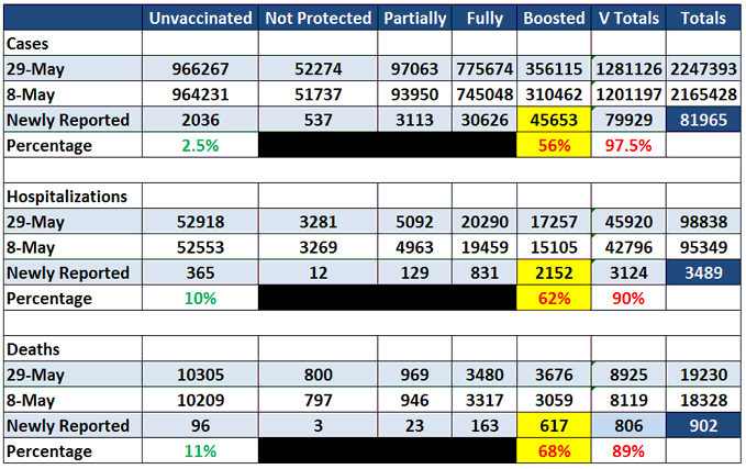
The most recent chart - that’s pretty damning is the following:
Because it literally shows 97.5% of the Cases, 62% of the Hospitalizations and 89% of the Mortality in V-Totals - Sum of all Vaccinated stratification.
The one thing you can notice is that underneath Cases/Hospitalizations and Deaths are 2 dates. May 29th and May 8th. 29th data is on top because it will show the Newest Numbers, which are typically an increase over the previous week and when setting up my Spreadsheets, it’s just easier (maybe lazy) for me to use the AutoSum button and replace : with -.
I try to keep this as a Weekly Update but quite often, Health Canada doesn’t cooperate so all I can do is keep several tabs open and keep refreshing.
You don’t have to do this.
The Wayback Time Machine helps…as does saving some screen shots of the data (it gets removed after updates).
Let’s begin!
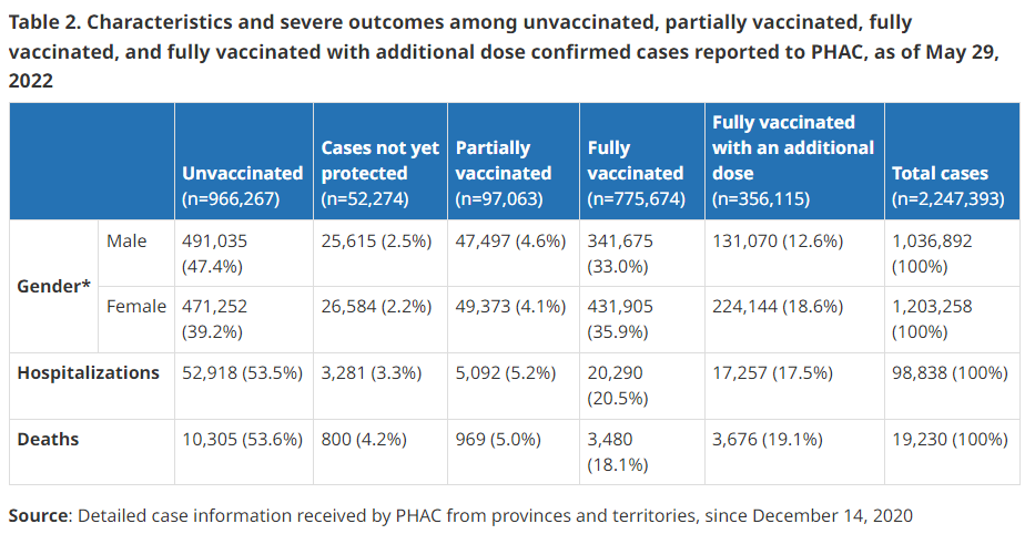
On the Health Canada COVID-19 epidemiology update →Link, if you scroll down, you will come to Table 2.
You’ve seen me post this same table several times…but may not completely understand where the information comes from.
Let’s break it down!
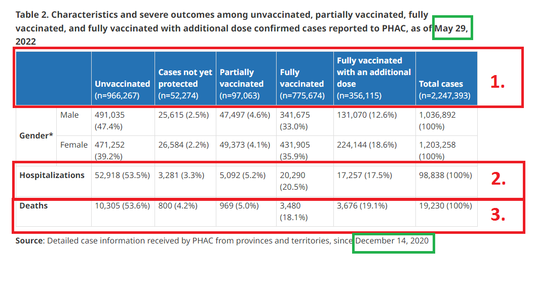
In the Top Green box on this chart, it will give the Current Date of the report. Note: Health Canada is typically 2-3 weeks behind in their reporting.
The Bottom Green box on this chart, is the date that they started recording deaths from COVID under a Vaccinated stratified chart - will always be December 14th.
Top bar is headers, but in the brackets, these are the total cases for each of the groups, ex: Unvaccinated (n=966,267).
Hospitalizations for each of the groups.
Deaths for each of the group - left to right.
This gives you the beginning of my charts, the balance is much the same only using a separate comparative date. And, again, the newest data goes at the top of my charts for simple calculations…and percentages I do by calculator so that I don’t have to continuously keep adjusting the autosum…hey, never said I was an expert with XLS.
Finding the comparative dates and data can be tricky and a lot relies on luck, screen shots and having an idea of what I am looking for.
Lot’s of credit goes back to the Wayback Machine for Historical Data.
Click this link (WB Machine HC Data Base) to pull the dates for comparison, note that the Table 2 isn’t always updated daily and you’ll most likely have to pull the PDF version to even see it.
You can find the PDF update version in the top right hand corner of the screen:
I hope this helps answer your questions and sorry for the delay in getting back to a lot of you regarding this question.
Keep posting in comments or reply to your emails if you need more help and I will answer as time affords.


"Because it literally shows 97.5% of the Cases, 62% of the Hospitalizations and 89% of the Mortality in V-Totals - Sum of all Vaccinated stratification."
Sheldon - Mistake - you meant 90% of hospitalizations, I think. It looks like you grabbed the number from Boosted instead of total vaxxed for hospitalizations.
"In the end the Party would announce that two and two made five, and you would have to believe it. It was inevitable that they should make that claim sooner or later: the logic of their position demanded it." George Orwell, 1984