

I've been duped...
I've been duped...
And I feel terrible for relaying unconfirmed information

For months, I’ve been admittedly and lazily relying on the charts created by Wikipedia for a visual representation of the data. They use the same government sources that I do, so I had assumed these to be correct.
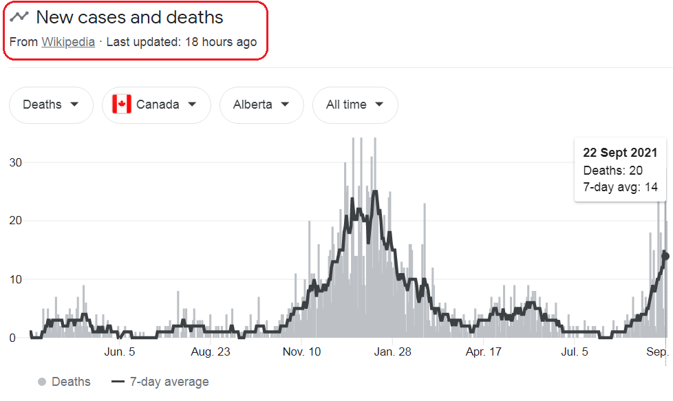
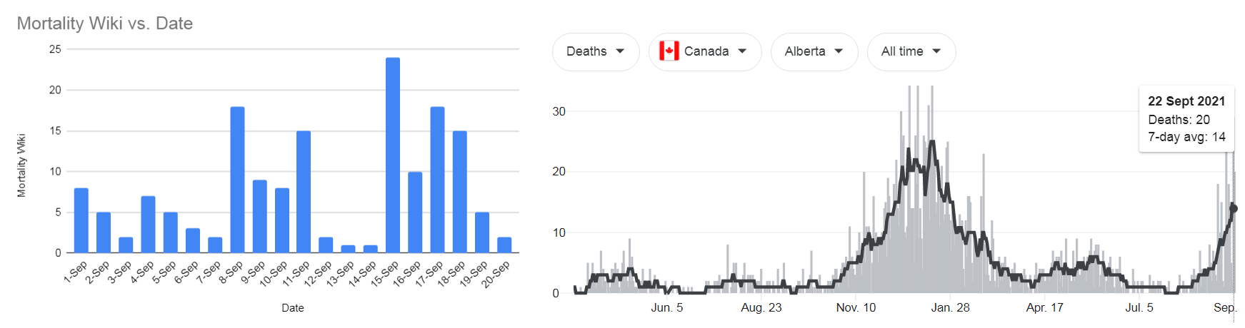
A few days back, Alberta reported 21 deaths and the Wikipedia chart shows a pretty dramatic situation for the province, looks like this:
But when I started drilling into the actual data made available, through the Provincial site, it didn’t quite match up, nor was it completely up-to-date with these 21 deaths. Not only did it not match up, it wasn’t even close.
Here’s an idea what this looks like:
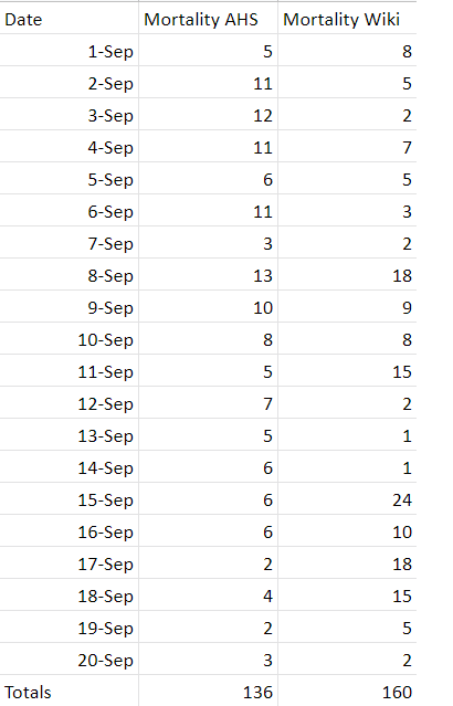
Somehow, for the exact same dates, Wikipedia indicates that there are an additional 24 deaths over what Provincial Data shows and when you chart this out, it looks a lot different and less dramatic.
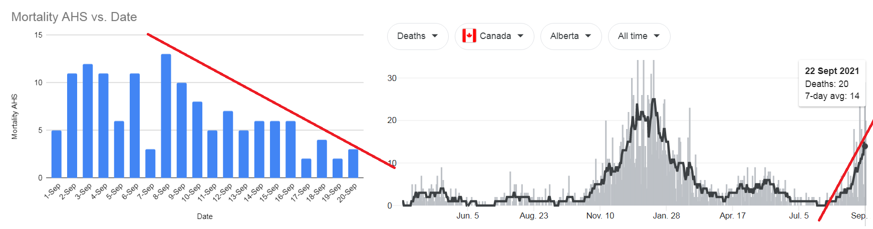
Actual Data Charted compared to Wiki chart:
Strange, hey?
Where in the provincial data, it shows that there was a decline from September 8th, Wiki shows a the data as a reinforcement of Provincial Lockdowns and Passport Measures.
What is even stranger about this is, when you chart the numbers from the wiki data, it doesn’t even match up to the chart they have posted. Their data numbers and their charts side-by-each, looks like:
Again, these 2 charts don’t seem to be telling the same story.
Alberta and Wiki Superimposed:

The total number of deaths is tragic, but seemingly over-reported and alarmingly portrayed by Wikipedia not allowing for any sort conclusion other than, by a quick look at Wiki, that the proverbial shit is hitting the fan and that just doesn’t seem to be the case.
I’ve been duped.
And for relaying inaccurate information, you have my humbled apologies.
I will be working a lot more with direct sourced information in future. We’re navigating through a Global Pandemic and should be providing as quality and accurate information as possible. This kind of shit is completely unacceptable.