
How Bad is your Performance if You’d Rather Look at Feces Instead of Your Own Quarterly Report?
I'll tell ya!

Wherever you live you will undoubtedly be exposed to the fear porn that has plagued the entire planet, on a daily basis. News and Media throw out case counts and hospitalizations, ICUs and Death rates to keep you conscious and acting accordingly based on the fact that if you so much as drop your mask, when you are alone in your vehicle or walking your dog, you could be the next person in the hospital on a ventilator.
And people believe this.
They show fancy charts and numbers that nobody understands but follow a narrative that you need to be vaccinated and you need to keep distanced from those who have no regard for their lives or yours - those dastardly unvaccinated people!
Here in Alberta, we have our Chief Medical Officer of Health - Deena Hinshaw who even takes to the Twitter Machine to keep all Albertan’s updated.
Today, Deena announced that we will be working with the University of Calgary measuring your toilet water for COVID.

How would you like to have this fucking job?
Aaaaaaaaaaaaaaaanyways…
It’s no shocker, if you’ve read any of my previous substacks on the subject that the Provincial Government is cooking the books. I’ve shown where Deena has grossly over-reported mortality on a daily/weekly basis as well as has padded the 2020 COVID mortality by 50+%.
Check these articles out if you haven’t seen them, as always, the information source is hyperlinked and screenshot:

Moving right along.
One thing Doc. Hinshaw does in her updates is to provide an update on how many tests completed and how many new cases are found to calculate our positivity rate, currently 4.3%:

If this number gets high, we lock down the province. If this number drops down, we consider letting people take a mask-less breath in a refined area of their home, head underneath a blanket for precautionary measures.
You see, the important thing to realize is that Alberta Health Services has the ability to recognize a worsening metric and pivot the entire province based on this.
Kinda.
Because they seemingly ignore their own metrics when it comes to how they’ve preformed and blame everybody and everything except for what they are doing to control this situation.
Here’s how it is.
Since the start of COVID, we’ve all known that there are Higher Risk Groups for suffering from COVID, which would reasonably mean that there are lower risk groups for COVID when in fact, there are not.
There are only At Risk. Everybody else doesn’t make up a significant rounding error in the math, don’t worry, I will explain.
Here are your High Risk Groups. They suffer from known Comorbidities or Conditions. We’ve known this since COVID hit North America.

People with these conditions currently make up 96% of the COVID mortality rate:
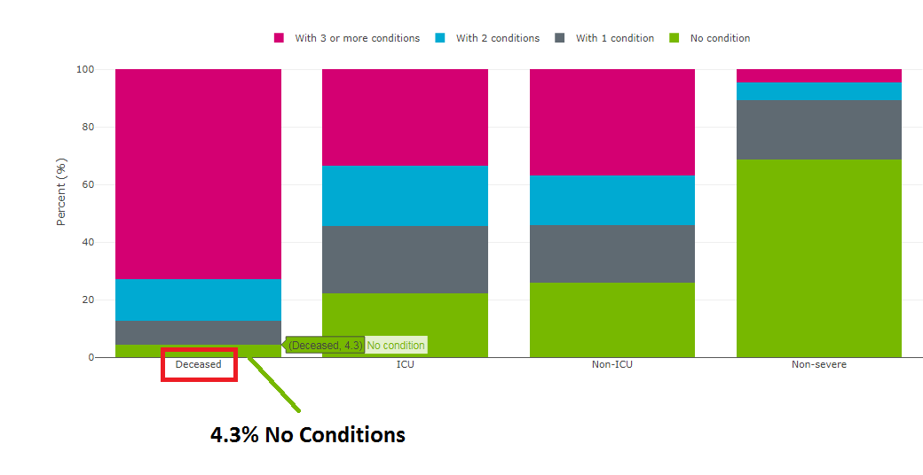
Over the course of the last 2 years, this number has fluctuated but is now at it’s almost highest level EVER. I’ve combed through the duration of the pandemic and it’s trail was explained in one of my substacks mentioned above but looks like this:

What you will notice is that the only time we’d seen this previously, only coincided with FLU SEASON!
So strange right?
If lockdowns, passports and vaccines helped, why is this number still gaining ground?
This is a silly point on it’s own and I wouldn’t waste my time writing about it only…and wouldn’t waste your time on something this bullshit. There’s more.
If you check out the age associated with the high-risk groups, you get something that looks like this:

Indicating what you probably already knew in that the highest risk groups of COVID Death are 60+ years old.
You see, these are the ONLY people that were ever ‘At Risk’, where as the balance doesn’t make up a statistical whole number. Do you care if a fraction of a person died from COVID? No…how could you?
These metrics are expressed in a numerically descriptive chart to show you what this actually looks like.

Hospitalized, ICU and Deaths.
Same thing that Deena Hinshaw is still talking about today, but they want to be “transparent”.
So, what would happen if you looked at all of the measures taken, including:
Masks;
Lock-downs;
Social Distancing;
Arrows on floors? ←I still don’t understand this;
Restricted Visiting;
Restricted Travel;
Blah blah blah, blah blah blah;
Measuring Shit for COVID in Sewage!
Well, I did the research so that you wouldn’t have to.
Current provincial vaccinations look like this, “Fully Vaccinated” - “High-Risk Age Groups, all greater than 90%

Greater than 90% of all of the At Risk Groups are Fully Vaccinated. This didn’t happen all at once, it was a progression, so as the vaccination rates increased, we should expect a decrease in the number of hospitalizations, ICUs and deaths by the same metrics, right?
This is true, but in fact if you look at it, there isn’t a single one of these metrics that has improved in any of the At Risk groups. In fact, all of them are getting worse. ALL OF THEM!
Starting with the 60-69 group, AKA - The LOWEST of the AT RISK Groups:

Moving onto the 70-79 group:

And finally the Highest of the At Risks, 80+:

These are, Quarterly Reports and up-to Current - from 3 days ago because, I’ve been busy and didn’t re-pull the stats and redo my charts. Trust me, they look the same.
Not one metric has been improved since January.
Not one At Risk Group has had better odds of survival for all that we’ve done. They keep banging the same drums, while the beat seems to continue to elude them.
If I was Deena Hinshaw and everything that I’d done over the last 2 years looked like this, I guess looking at shit seems positive.
In your last set of charts, what is the Y axis?